
Documentation needs to be simple, clear, and to-the-point. We all know that. But who said it can’t also be visually appealing? Who said we can’t make using our documentation more fun, without compromising the quality or accuracy?
And yes, this does apply to API documentation, which probably isn’t associated with eye-catching visuals very often.
You can approach the visual side of the documentation in many different ways. Some common solutions might be:
- Applying the client’s brand colours to the headers.
- Applying the client’s brand colours to bulleted lists.
- Using the client’s logo as an icon for notices.
And these are fine, absolutely. But in this article, we would like to show you something that is less typical. Something that will really make your content stand out.
How to make effective API docs?
We will demonstrate three design ideas we implemented when creating and improving documentation for a client from the gaming industry. Let’s get cracking!
Branded diagrams
Let’s start with the diagrams. To describe our client’s environment, we needed to present quite complex processes and flows, with many components interacting in a very specific order.
The first thing we did was avoid traditional “boxes with text”. These tend to get inflated when you try to put the necessary content inside. And we wanted to limit the amount of text in the actual diagram as much as possible.
So we went for simple and elegant circles with icons representing specific components, and at the top of each diagram we embedded a legend that explains which icon stands for which component. Have a look at a small piece of such a diagram, with random text and the client’s logo switched to a generic question mark:
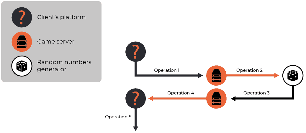
By moving the component names entirely to the legend box, we’re making the diagram much easier to follow and digest. And while we’re allowing the audience to focus on the visuals, we’re not compromising the quality of the message we’re delivering with each diagram.
Also, we designed the diagrams in such a way that the client’s colours are implemented consistently throughout. This is important as the documentation should feel like an integral part of the company brand identity.
Want to find out more?
Attractive API reference
When it comes to implementing the client’s brand colours, we didn’t stop at diagrams. The client had two APIs that needed proper documenting: a popular RESTful API and a very specific JavaScript library.
For the former, when presenting the methods in the API documentation, we applied the client’s primary colours. For the latter, we indicated each element with the client’s secondary colours and introduced the concept at the beginning of the reference. Just like so:
We think this is a nice touch that shows the client that “attention to details” doesn’t have to be merely a catchphrase.
By the way, if you want to see how you can make your API reference so great that the devs will thank you, check out the article on our blog.
Innovative screenshots
Perhaps the bravest idea was the approach we took to screenshots. A quick disclaimer: basically, we’re against screenshots in modern documentation. Traditional screenshots:
- Rarely add any value to the content
- Are not future-proof
- Mostly generate costs and effort
That’s why we’re strong advocates of implementing SUI (or simplified user interface) wherever possible. But there are cases where we do need to show an actual screen. Since our client was from the gaming industry, you can imagine we couldn’t present an implementation of a specific feature and not show the gameplay. At the same time, we wanted to attract the viewer’s attention to particular elements.
So how did we do it? We reached out for a solution that’s pretty innovative when it comes to technical documentation. Frames and arrows are things of the past, we didn’t want that. Instead, we decided to use black-and-white images with spots of colour for the focal points only.
For legal reasons, we can’t show you the actual examples, but good ol’ Mario will do 😉 If we wanted to present the Warp Pipe component, this would be a good example:

This solution requires some level of graphic design skills (plus a graphics tablet, unless you enjoy tedious clicking), so it’s always best to ask a professional for help.
These are just some of the design ideas we would like to share with you. If you’d like to find out how to make your API documentation stand out visually, feel free to contact us. We know the answers to all your queries. Alternatively, you can read more of our blog posts, such as this one on how API can be used as part of continuous deployment, or visit our API service page here.