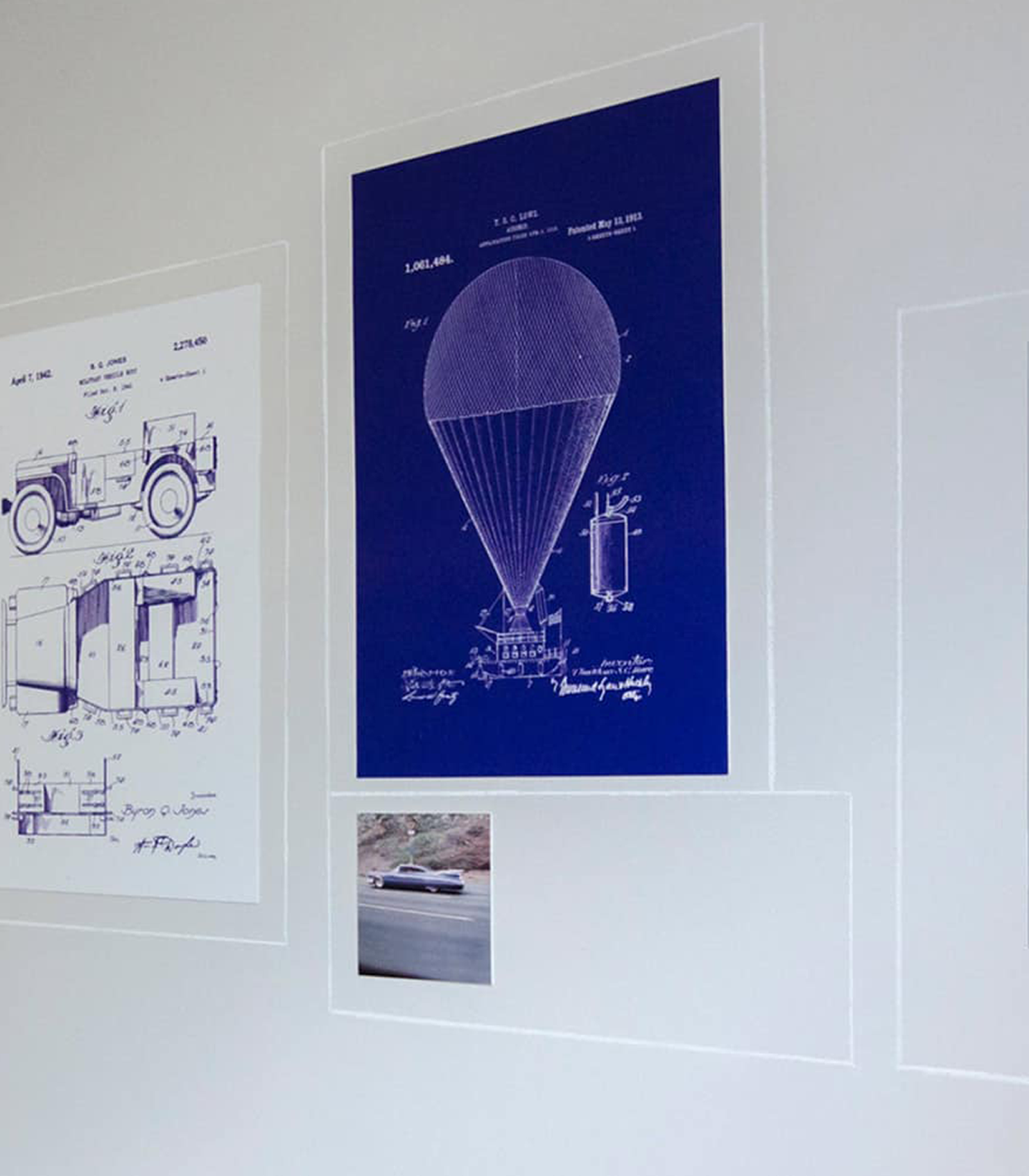
Clear technical documentation.
Complex translation & localization.
Our services
Want to find out more?
Why choose us?

Experience: 19 years and >300 customers

Quality: ISO 9001:2015 BSI certified FS 588086

Understanding: expertise in many industries

Innovation: applying the latest and best for you

Service: >90%
customer retention

Flexibility: in-house team + worldwide networks

About us
3di is an award-winning provider of technical communication, translation and localization services. Established in 2002, 3di has a proven track record of delivering projects for businesses in a wide variety of industries – including global telecommunication companies and retail multinational Primark.
With a highly qualified and experienced in-house technical writing team, an extensive worldwide network of specialists at its disposal and the latest authoring and translation tools, 3di is able to tackle a variety of projects, such as:
- Authoring technical manuals, product user guides and instruction manuals
- Producing API documentation
- Creating and running award-winning information portals
- Providing expert help with e-learning translation and localization, software translation, as well as user manuals and technical documentation translation
- Providing consulting and training services for DITA implementation, information design and specific software tools, such as Madcap Flare and Lingo
- Source technical writers and translation experts to help with your projects, whatever they may be
3di is BSI audited to ISO9001:2015 standards and a member of the ISTC (the Institute of Scientific and Technical Communicators) and GALA (the Globalization and Localization Association). 3di has also won numerous awards for a variety of projects, which you can read about on our awards and accreditations page.
Case Studies
3di works with organisations of all sizes, providing technical writing, translation and localization services. Our customers, including world-renowned brands and specialist businesses, all face complex communication challenges. They need that complexity made clear.

Who we work with
Our recent posts
Here are some of our most recent posts, where we share what we have been doing, what we know about technical communication, translation and localization and what we think of the latest industry developments.
The Secret Life of Technical Writers
Find out how technical writers make great documentation.
Read MoreTechnical communication in film 2: The bad examples
We list our favourite examples of technical documentation in film and TV
Read More


