In a previous blog post, I invited any museum curators who would be interested in talking to technical communicators about how museum exhibitions are put together to get in touch. So, you can imagine that last week I was very excited to be meeting up with Katie Eagleton (curator) and Anna Bright (interpretation officer) from the British Museum, along with Chris Atherton (UX consultant) who had put us in touch.
Technical communication in museum exhibitions
When we got talking, I was struck by some very strong similarities and some interesting differences between our worlds. In no particular order, here are some of the things we talked about and insights from our conversation:
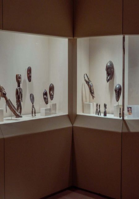
1. People who design museum exhibitions worry a lot about getting the level of detail right: too much, and people get overwhelmed; too little and it’s difficult for them to engage with or learn from it. I found this very similar to the concerns of people designing software UIs and the information that supports them.
2. When thinking about design and detail, one of the factors to take into consideration is the need to ensure that when the exhibition is busy people don’t bunch up in one part of the room – e.g. because an information board takes too long to read. This is a problem I’ve never had to deal with when designing software UIs or user information.
3. “Permanent” exhibitions often stay in place for 20 years or so, which needs to be taken into consideration when designing them. Unlike the case with software, there aren’t many opportunities for evaluating a “beta” version either.
4. It’s not uncommon for visitors to spend a couple of minutes when they first step into a museum looking slightly dazed-looking for signposts or suggestions of which way to go. This reminded me of observations from usability tests on software: when users first start the software or open a new screen, there’s a moment (often a very long moment; sometimes quite a stressful moment – though that may just be an effect of the usability testing context) when users are just trying to take in what they’re seeing, and desperately looking around for clues for where to start. We talked about whether there would be any value in applying some of the things we do in software to help people with this moment to museums – or if, in fact, thats was already happening.
5. Normal exhibition design process generally starts with fully designing the overview information and flow of the exhibition before writing the text for individual artifacts.
Want to find out more?
6. Anna says that interpretation officers might sometimes describe part of their role as “translating” from the very detailed, extremely knowledgeable viewpoint of the curator into language and a viewpoint that museum visitors can relate to. This description will probably be very familiar to many technical communicators…
7. One measure of success in museums is how long people stay in a particular exhibition: people staying for a long time suggests they’re getting something out of it. How does this compare with time-based measures in software UX (depends on the software?) or user-information (depends if it’s help/support/tutorials?)
8. Designing exhibitions involves scissors and quite a lot of masking tape (thanks to Katie for sharing the photo):

9. If anyone reading this has been following my recent posts about who should write the words in software UIs, you might be interested to know that a very similar discussion goes on in teams at museums: responsibility for writing the words in exhibitions can sit with curators, interpretation officers, designers, or some combination of them – depending on how the particular team organises itself.
10. Museum teams are concerned with many of the same concepts as software development teams … but use an almost entirely different terminology to describe them. (So apologies if my notes above read oddly to any ‘museuming’ people who are reading.)
The sequel
As you may have gathered, I had a thoroughly enjoyable evening talking. The great news is that I and a hand-picked group of experts on software UX and user assistance are meeting up with Katie and Anna at the museum, to experiment with applying evaluation criteria from our world to the design for a new exhibition that’s in development. I’m hopeful that we may even get an opportunity for a return visit – to apply exhibition design evaluation to software UX, too.
p.s. if you’re interested in the relationship between UX and technical communication, you might also like to read this article by my colleague, Barbara Kujawska, about how using UX principles can improve technical writing.
Originally published 16.11.12