Back in the day, I used to work as a user experience designer (aka UX). Only now have I realised how deeply this affects my perception of the technical UX writing process.
I came to this – rather surprising – conclusion after a quick chat with Paul Ballard, 3di’s Managing Director. We were discussing how important it is to always keep your target audience in mind, why we should make text easy to read, and how to structure content.
Then it struck me – all the best writing practices used by 3di would be called UX writing in the realm of design! Even more amusing is the fact that the UX writing phrase itself is barely known in the technical communication industry, whereas that’s exactly how we write the docs here, at 3di.
It’s all about UX writing
UX writing means using words to improve user experience. What does it mean in terms of technical communication? It means crafting copy that guides users. It’s also about helping users interact with the product your documentation is designed for. So, what are the best UX writing practices?
Know your audience
Both in technical writing and in UX writing, the audience comes first. No matter what you write. That is why you should only provide the information the audience needs. Otherwise, the unnecessary bits of information get in the way of comprehension.
In UX design, there’s nothing worse than a user interface that needs explaining. That is why I cared about knowing the audience better. Whether that was through user research, usability tests or getting as much detail as possible from subject-matter experts.
Want to find out more?
Use structure to support scanning
There is a reason why well-designed websites do not display long blocks of continuous text. For the same reason, in tech comms, we use short paragraphs, add titles, and try to group similar content. The shorter paragraphs the better because people rarely read from beginning to end – they scan. And they use a whole host of structural elements to break up their scanning.
At 3di we also think about this scanning behaviour, using structures, providing clear links to related information and presenting one paragraph, slide or screen per idea. This makes it easier for the user to find what they need.
An excellent example of this approach from the UX world can be seen when you shop online. Have you ever wondered why, in well-designed online shops, the top menu is often hidden for the time of order placement and payment? The designer probably didn’t want to distract your attention from the shopping process.
Keep it simple
Creativity can be tricky for both technical authors and for UX designers. Helping users get the best from a product is often about making understanding the product invisible – it just feels easy to use. More often than not, that means using very familiar techniques and avoiding new or creative approaches that could cause the user to pause and have to process what they are looking at – too much creativity can cause cognitive barriers to get in the way.
When I first started as a UX designer, I was tempted to propose a completely new, original solution to a problem… which had long been solved, but we had simply forgotten. We re-deployed the simple solution and the problem was solved! The creative insight was in recognising the connection between the problem and the proven, simple solution.
And this is often what drives the creativity in the technical writing teams at 3di. Our new customer has a problem that on the surface looks special, and needing a bespoke solution. But looking under the surface, recognising the patterns and the similarities with other problems opens up simple routes to deploying solutions we already know will work. You can read more about some of our Information Design approaches.
Want to find out more?
Be consistent
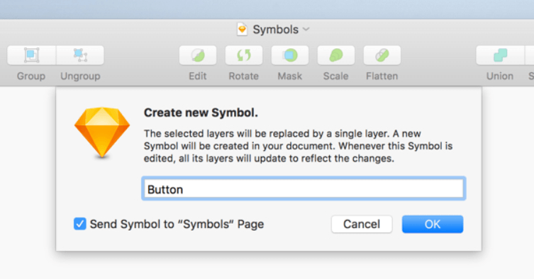
When I was designing user experience, consistency meant using the same elements in different design views. Having that purpose in mind, I was using the symbols feature. I was able to turn a pop-up notification window into a symbol so that I didn’t have to create it again and again in different views. When doing UX writing, I didn’t have to design microcopy several times because text also could be transformed into symbols.
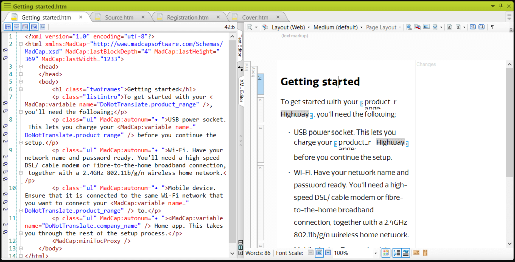
In tech writing, it’s similar. I use symbols, but under the name of variables and snippets. Thanks to that, I can easily re-use words and phrases in my documentation. Here’s our case study about the way we maximised re-use across product manuals for Promethean.
UX writing solutions: stop writing, start designing
Looking at technical writing from the designer’s point of view, I can’t help feeling that instead of WRITING the docs, we should be DESIGNING the docs. After all, as we’ve seen, the techniques of UX writing and UX design fit very comfortably in the world of technical communication, it’s just a matter of perspective.
When we work with new customers, we introduce them to our tried and tested 5-stage process, which ensures we create clear and engaging content. Our UX writing process is as follows:

This is pretty much the same process my colleagues and I followed as UX designers, so 3di must be doing something right!
Here’s our case study about our work with Bridgehead Software, which is an example of our ‘design first, then write’ approach.
In case you need professional advice on how to make your docs more user-friendly, 3di’s technical writers and information designers are here to help – just give us a shout!
Related articles

Capturing information and crafting content
Read our guide on capturing information and crafting content
How to review your documentation with fresh eyes
Being able to review your own work is an underrated skill